Home Page |
About Me |
Home Entertainment |
Home Entertainment Blog |
Politics |
Australian Libertarian Society Blog |
Disclosures
Adapting to Motion
This version: 1 July 2010, previously published in Sound and Image, May 2010, v.23#06, pp.45-48
In my reviews of equipment I frequently refer to an arcane process called 'Motion Adaptive Deinterlacing'. Since I'd rather not just make pronouncements as to quality, but equip you with greater understanding so you can make your own informed judgements, let me explain exactly what I'm talking about, with the help of some pictures.
A quick primer, first, on what interlacing is, why it needs to be removed (ie. 'deinterlaced'), and the best way to do it.
Interlacing
Video and film are, of course, a sequence of frames shown in rapid succession. In the olden days to reduce the amount of data having to be sent over the air waves, only half of each frame was sent at a time, followed by the other half. Each half was called a 'field', and consisted of every second horizontal scan line for that frame. The second field contained the other scan lines.
On the TVs of the day they were simply shown in the same order in which they were transmitted, and this worked well enough on the small and fuzzy equipment then available.
But plasma and LCD TVs have much, much larger, and much, much sharper displays. Try to use the same display technique and they would simply flicker. So the interlaced signal had to be recombined in some way.
The question was, how do you join the two fields together to make a frame?
It all depends on where the frame came from.
Some frames -- many of them -- come from a film camera. These are easy to deal with. Each of the two fields making up a frame (in our 576i50 and 1080i50 systems) came from the same film frame. So all the TV has to do is 'weave' the alternating lines of the two fields back together again. This restores the original frame.
But some frames come a video camera. A film camera records both fields at the same time. A video camera records one field, and then the other a little later. You can't just weave them together because then you'd end up with a jaggedy mess. The following frame -- taken from the DVD of the 1970s
'Norman Gunston Show', illustrates this.
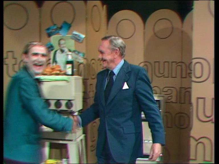 Norman, left, is moving to the right to greet the former Prime Minister, who the camera is tracking. Because these were studio cameras, they were interlaced, capturing the two fields some one fiftieth of a second apart. So you can see that Norman is indistinct, while the PM is fairly sharp. Norman had moved a significant distance in that one fiftieth of a second, while the PM had moved only a small distance.
Now let's zoom in on Norman's chest so we can see what has happened:
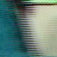 Clearly this would look unacceptable on your nifty 127cm full high definition plasma. We have simply woven together the two fields, and it looks dreadful. We call those horizontal lines 'combing'. To make this look presentable, the TV will do a different form of deinterlacing suitable to video sourced material. The most basic form of this is called 'bobbing'. This shows the first field -- scaled up to fill the screen -- then the second field. Then it moves on to the next frame.
How this scaling is done varies according to the circuit. The simplest ones simply double every 'scan line' (ie. horizontal row of pixels). They repeat the first row of pixels on the second row and so on. This tends to result in jaggies, so some more sophisticated circuits look create new intermediate lines by interpolating from the line above and the line below. That's what I've done here, showing the same detail from the same frame, but deinterlaced in this manner:
 As you can see, this is a lot easier on the eye, and in practice shows more detail because it lacks those obscuring comb lines.
Bobbing And Weaving
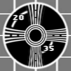
But it does lead to a problem: often a part of the picture isn't moving, even while another part of it might be. Here, for example, is an old Australian
ABC TV test pattern captured some years ago from digital TV:
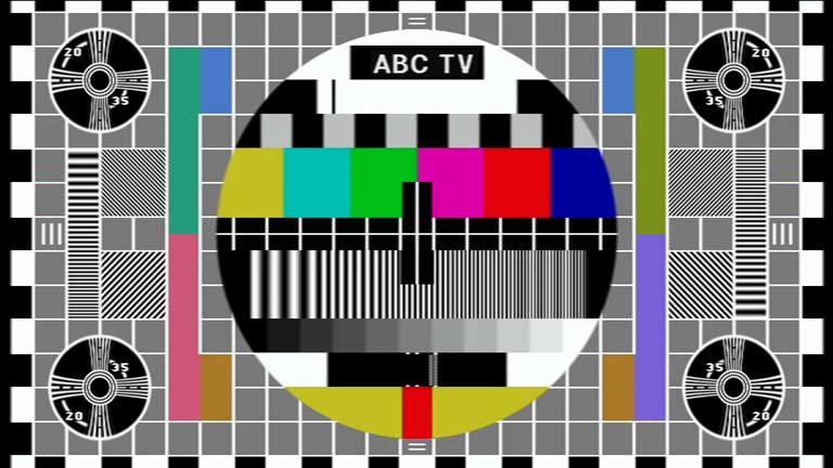 This is almost entirely static. Almost. In fact, some 0.085% of the pixels are moving: a vertical white line in the black bar towards the bottom of the large circle. This is going from side to side in that black area. Let's look at this closely (double actual size):
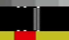 You will see that the white bar has split in two, half from one field and half from the other. If the picture is bobbed, then one of these will be eliminated, providing a nice clean result in this part of the picture. But the rest of the frame will also be bobbed. What does that do? Here is a close up (double actual size) of the circle at the top left of the screen, showing what it should look like (ie. the two fields are woven):
 But if it is bobbed, this is reduced to two different half-resolution versions:
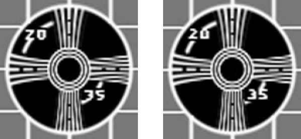 Now each of these is clearly of much lower quality than the woven version, with the small '2' and '3' characters merging into the lines nearby, and the horizontal curved lines becoming jaggedy and indistinct. What I can't show properly on this page is that the picture is rapidly alternating between these two versions 50 times a second. This may seem too fast to notice, but unfortunately it is all too obvious, and highly irritating. And the larger your display, the worse it is.
Doing It Properly
The solution is obvious, but not at all easy. It is for the electronics to examine the two fields, or in more powerful systems, the fields in a few frames, and see which parts appear to be static, and which parts appear to be moving. And then to weave together the fields only in those static parts, and bob the moving parts. In practice what happens is that the system bobs not just the moving parts, but the areas of the picture close to the moving parts as well.
Conveniently, our eyes aren't as capable as picking up detail on moving objects as they are on static ones, so the loss of picture quality is actually minimal.
This is called 'motion adaptive' deinterlacing, because it adapts its operation to whether or not any particular part of the picture is in motion. Let us see this in operation.
This is a shot from a test clip on the
'HD HQV Benchmark' test Blu-ray disc (the 'Video Resolution Loss Test' if you have the disc and want to check for yourself). This disc contains patterns designed to disclose different aspects of performance by Blu-ray players and displays when dealing with interlaced high definition video (1080i60 in this case):
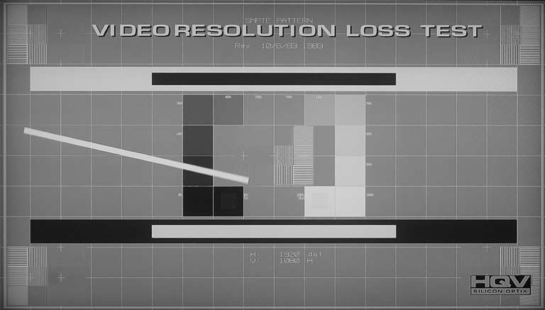 That diagonal white bar on the left side of the screen is actually rotating clockwise around its centre at ten rpm, but everything else in the frame is perfectly still.
Now let us look what happens to a part of the still background as that moving white bar nears, moves over, then passes away from it. Note, all the forgoing images were digital captures from the sources, but for this HQV disc this was straight photography from a screen. The disc was playing on an Oppo BDP-83 Blu-ray player with its deinterlacing mode set to 'Auto'. This player uses Anchor Bay Technology deinterlacing, but other brands -- if well implemented -- perform in a similar manner.
So let us look at three close ups. First:
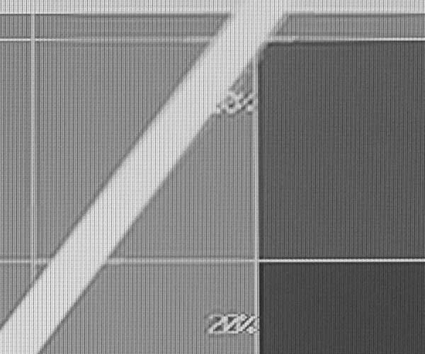 On the horizontal white line above the largely obscured '30%' you will see, at the extreme left, a finely etched and nicely sharp horizontal line. Likewise on the right. But in the area around the moving bar, it is fuzzy. At the extremes, the motion adaptive deinterlacer is weaving together the fields to create a fully detailed frame. But near the moving element of the picture it is bobbing, having the effect of reducing the vertical resolution of the picture.
But not the horizontal. Look at the vertical line to the right of the numbers. This retains the same width and clarity regardless of the distance from the moving bar.
Now to the second shot, where the rotating bar has moved on a little further:
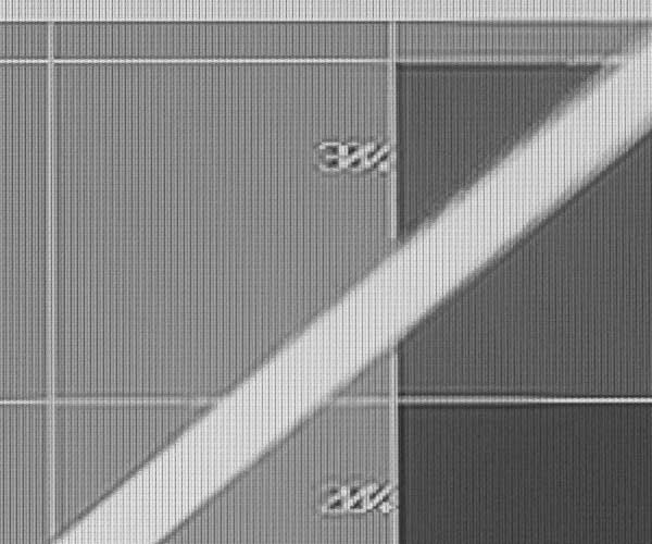 The indistinct area on the horizontal line has moved to the right, along with the top of the rotating bar. The '30%' figure is partly woven (at the top left) and partly bobbed as the moving bar's field of influence moves away from it. The reverse is happening with the '20%'.
The third shot, where the bar has progressed even further:
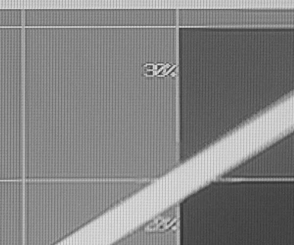 On this shot the '30%' is now as sharp, clean and detailed as it can get, while the 20% is now fully fuzzed up by the bobbing zone around the moving bar.
Conclusion
And this is how it should be. Dealing with interlacing -- introduced for sound reasons many, many decades ago -- has been a matter of great difficulty since the introduction of large, naturally progressive, displays. There is no perfect way of dealing with it. But high quality motion adaptive deinterlacing, provided by the likes of Faroudja, HQV/Reon and Anchor Bay Technology, plus some proprietary systems, can deliver image quality nearly as good as a full film-based system.
Which one of the reasons why I pay so much attention to it.
© 2010 by Stephen Dawson