To repeat from the last post: Same Line Allocation is where the display simply throws out source lines L2, L4 … L1080, and also throws out source lines R2, R4 … R1080. In other words, all the even numbered lines are disposed of, leaving only the odd numbered lines. So L1, L3 etc are displayed on their intended odd numbered display lines while R1, R3 etc are shifted one display line down and shown on the even numbered display lines.
Now this was a technique that has in fact been used, even though I had recently come to doubt it.
Indeed, I had insisted here that this technique had been used on a passive 3D TV I had reviewed last year. But here’s the thing: firmware had since changed. I had been unable to get my hands on the same model of TV again to confirm my initial understanding. A couple of websites had insisted that these TVs used Alternate Line Allocation, while an expert in the field had by email suggested that he also thought that likely. My memory began to lose its clarity on the subject and, as I put it in a previous post, ‘by golly I’m irritated that I didn’t apparently take a photo of the Toshiba screen showing this.’
I hate it when I gradually form the view that I’ve made an incorrect interpretation and am feeling that I need to issue a correction.
Which is what I was planning to do today.
But having just taken a series of new photos showing what’s going on with current passive 3D TVs, I stumbled across the photos I took of the Toshiba passive 3D TV’s display back in September last year. And they establish, I believe, that I was right all along. In what follows, I have cropped and scaled, but not otherwise processed these two photos in any way.
The TV was the Toshiba Toshiba REGZA 47VL800A, a 47 inch passive 3D unit. The disc involved was the Blu-ray 3D version of the startlingly inane movie Cats and Dogs: The Revenge of Kitty Galore. To recap: the main menu of this disc is in Blu-ray 3D format (ie. frame packed 1080p24). But most of the picture looks flat. Here it is, scaled down to fit:
The area from the horizontal line down is 3D in the sense of having displaced left and right images, the area above it is 2D, in the sense of both left and right eye images being identical.
Now I took two photos of this menu on the Toshiba screen. In neither case was the photo taken through the 3D glasses! This is important. What you are seeing is how the electronics of the TV allocates the source lines to the display lines. One of the photos was taken of the screen as presented by the TV without any intervention. The other was identical in every way, except that I had switched off 3D in the TV. That is, the TV has been instructed to ignore (probably) the right eye view and display only the left eye view as though it were regular 2D Blu-ray content.
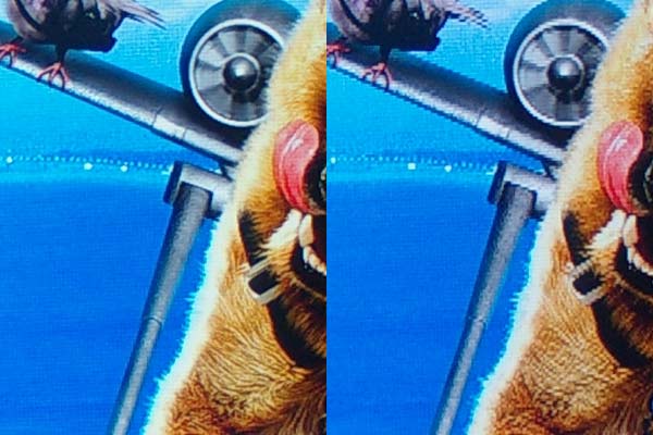
Now let’s look closely at the menu bar at the bottom. Remember, the source has been created with horizontally displaced words so that they pop out in 3D. But we are not using the glasses, so all we see with the 3D picture are the menu items heavily ghosted. What follows is the same area from the two photos, not scaled at all but cropped down, side by side. The same content with the TV set to 2D on the left (to force only the left eye content to display) and proper 3D on the right:
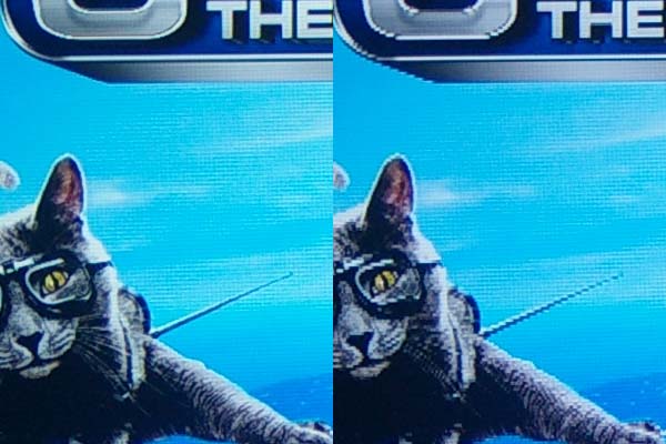
Now here’s a flat part of the picture, arranged as above. Note the jaggies on the cat’s wing and on the title box:


