
So far as I am aware, there is no convenient book that fully describes all the range of issues regarding picture quality that I, for one, need to know. So what I have learnt has resulted from a painful process of reading spottily, examining actual products, thinking about what I see, applying different settings on different equipment and comparing the results, and trying to relate all this practical experience to what I know so far.
The problem is that without an authoritative source, there is a possibility that my understanding is quite askew. This is particularly a worry in view of the fact that I am myself by now regarded as somewhat of an authority on these matters. If I am wrong, then I may be misleading others.
So it is very gratifying when a truly authoritative voice lends its support, as in the case of my Blog entry Can’t fix what’s too broke below.
Yesterday I received an email from Craig Mecak, who is in charge of Broadcast Quality Control for Australia’s Channel Nine TV network. He was commenting on that post and, at my request, he today kindly gave me permission to reproduce his email:
I read with interest your blog on the above.
As someone who works in the TV industry in a technical role (TCN 9 Sydney), I can totally sympathise with what you discovered.
The simple answer is that it is artistic intent.
I have fought, and will continue to fight wherever possible, the stupid practice of ‘field-drop’ techniques to give a 50Hz interlaced-video originated picture a ‘fake’ 25Hz ‘film look’.
As you discovered, a fake 2:2 cadence is created simply by deleting one of the original fields in a video image, and repeating the one before, in order to give the video a film-like judder, but of course half the vertical resolution is lost in the process.
Film doesn’t have this problem, as the two distinct fields are sourced from the one frame of film in the first place, and when they are weaved back together, full 576 line resolution is maintained.
PS, the same goes for HD. Some people have made 1080i sourced images 540p then back up to 1080i, deleting one of the fields in the process, introducing not only 2:2 judder but also lost vertical resolution.
I have always encouraged producers of programmes, that if they want that effect, to plan ahead and shoot at the required frame rate at time of acquisition, not a post-effect that ruins quality.
ie Shoot at 24p (or 25p) at full vertical resolution at time of capture (576 or 1080) if the motion judder is the effect required. Otherwise, stick with smooth high frame rates of 50 or 60Hz capture.
I find it difficult to comprehend why such an artistic choice would be made in any circumstances, and especially for a cooking show. Yes, I can see that the film cadence — 25 full frames per second, rather than the usual 50 half-frames (ie. fields) per second 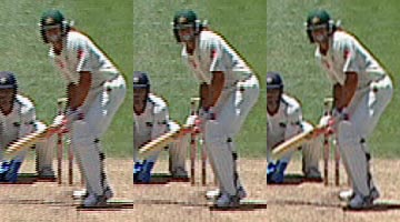 of interlaced TV — may present an attractive result in some cases. And, indeed, the obvious way to achieve this would be to use film, or a 576p25 video camera.
But the idea of ‘field-drop’ truly is insane! It absolutely guarantees jaggies — especially in cooking shows where there are a lot of hard sharp edges, such as pots and pans and knives. Furthermore, there is no way these jaggies can be corrected by the display equipment.
At the very least, I would have thought that if ‘field-drop’ was being practiced, then a slightly more advanced approach could have been adopted. Instead of each horizontal line being repeated, then new horizontal lines could be interpolated from the ones above and below them. This is precisely what modern consumer level technology does when deinterlacing 576i material. To avoid jaggies as each field is presented in sequence, new intermediate lines are interpolated and in most cases this turns what would be jagged diagonal lines into smooth ones. One example of this kind of circuitry is Faroudja DCDi, which is inexpensive enough to be incorporated into a wide range of consumer equipment.
(Decent deinterlacers do more than this of course, including adapting for motion so that for static parts of the picture the relevant parts of the fields are woven in a film-like manner to yield maximum detail.)
In case you think I’m exaggerating the picture degradation from this kind of drop field technique, I present a detail here which I grabbed from today’s broadcast of the first day of the second cricket test match between Australia and India. That’s Andrew Symonds facing the bowling. Each of the original details were 100 pixels wide and 200 pixels tall, of the 1,024 by 576 pixels of the full screen. On the left I have left this in all its original interlaced glory, showing horizontal combing lines due to movement between the two fields. For the centre part, I have deinterlaced the picture in Photoshop, but used a simple field-drop technique. On the right the second field was also dropped, but instead I applied interpolation to generate new lines to fill in the spaces.
You will see that Symonds’ bat is very jagged in the left and centre sections, but far less so at the right. Interestingly, his back is more jagged in the centre drop-field section than it is on the left, interlaced, section, and far more so than the right section. The reason is that his back was hardly moving in the original, so there is very little combing. Dropping fields introduces a step pattern that wasn’t previously there.
More than this, though, the overall coherence of the centre picture is far greater than the left, with more detail being apparent and far greater realism. This may not be apparent immediately, but if you download this graphic and zoom in on it with a preview program, it will be obvious.
Incidentally, I seem to remember being puzzled by odd jaggies in ‘Top Gear’ in some scenes. I suspect that this also applies a naive ‘field-drop’ technique, at least part of the time.
In today’s email Craig says:
I have often rejected programmes that use the field-drop effect, most from the UK, but as you can imagine, it’s difficult for the producers to go back and re-edit a programme just because Australia doesn’t like that particular creative effect.I re-wrote our tech specs for programme delivery to discourage the practice, and can only really hope that they take note.
While I’m critical from time to time of the quality emanating from our TV stations, I must say its great to see people like Craig hard at work trying to make it better.
 UPDATE (Wednesday, 2 January 2008, 9:56 pm): Wow, that was dumb! I used the cricket graphic above to illustrate my point simply because I happened to be examining it for other reasons. But first I must emphasise that the cricket broadcast is not subject to any silly field-drop techniques. It is sourced from video cameras, so it is interlaced, and consequently good display quality can be problematic. But it is not artificially made worse.
Second, I should have used the same Jamie clip to illustrate the point. And that’s what I have done here. On the left is Jamie, captured from the same frame, without any additional processing other that cropping and further JPEG compression. The one on the right is the same graphic, but deinterlaced in Photoshop using the ‘interpolation’ technique.
Points of interest: Jamie’s face is clearly easier on the eye in the interpolated version, especially around the mouth and nose. Most of the jaggies are either eliminated or significantly reduced. The exception (with only a slight reduction) is the wire basket at the foot of the images. Near-horizontal diagonals are the hardest to smooth out. In fact, examination of near-horizontal diagonals is a common technique for assessing deinterlacing quality.
The downside is that the overall picture seems just a touch softer in the interpolated version, but this is a small tradeoff in my opinion.