Fine music and fine wine

Sometimes I think the art of listening to hifi — not for the music, but for the performance of the system — is somewhat like the art of tasting wine. Long time readers would realise from that association that I suspect that much in wine tasting is totally imaginary.

But of course there are differences. What is ‘good’ in wine is open ended. You may have a wonderfully enjoyable wine that is dry, while another is sweet, while a third is spicy. One is not necessarily better than the other. I imagine that in the wine tasting community, some degree of individual preference is acceptable.

In hifi, I think most would agree that ‘good’ is not at all open ended: a good system is one that approaches the sound of reality. A better one is one that more closely approaches that.

Defenders of, say, vinyl LPs as being superior to CDs, or analogue as being superior to digital, typically do not claim that their side is less accurate, but preferable because it is more to their taste. They usually claim that it is more accurate than the newer technology, at least in one or another important way.

Still, it is interesting to consider how such things as knowledge and price play into perceived quality for wine. Some interesting information appears in a 2008 paper from the American Association of Wine Economists: ‘Do More Expensive Wines Taste Better? Evidence From A Large Sample Of Blind Tastings‘. Here’s some of the abstract:

Individuals who are unaware of the price do not derive more enjoyment from more expensive wine. In a sample of more than 6,000 blind tastings, we find that the correlation between price and overall rating is small and negative, suggesting that individuals on average enjoy more expensive wines slightly less. For individuals with wine training, however, we find indications of a positive relationship between price and enjoyment. … Our results indicate that both the prices of wines and wine recommendations by experts may be poor guides for non-expert wine consumers.

That is, if you’re an expert you will tend to enjoy more expensive wines when you taste them, but the average joe would actually prefer the cheaper stuff.

However, as always, expectations have a significant effect. From the conclusion:

In another fMRI study, Plassmann et al. (2008) test whether marketing actions such as changes in the price can influence the experienced pleasantness of a product such as wine. Testers are given different wines that they are told differ in price. In reality, some of the wines are the same but simply presented with different prices. Prices are found to correlate positively with experienced pleasantness, measured through both subjective reports and fMRI scans.

If you know the stuff costs more, then you think (actually think, not pretending, if the functional magnetic resonance imaging scans are to be believed) it tastes better. Similarly, if you think something has been tainted before you experience it, you are more likely to ‘notice’ that it has been tainted than if you’re told afterwards:

There is a large relevant literature related to marketing. Lee et al. (2006) look at how knowledge of a beer’s ingredients (normal beer with added vinegar) can affect subjective appreciation. They show that the timing of the information plays a substantial role. One group of tasters is told about the vinegar, tastes the beer, and assigns ratings. A second group is told about the vinegar after tasting the beer, but before the ratings are assigned. On average, individuals in the first group assign significantly lower ratings, suggesting that informing participants about the vinegar influences the experience in itself.

And maybe loudspeakers carrying a prestigious brandname sound better to us than those carrying a common or unknown (but vaguely Taiwanese or Chinese sounding) name:

Using fMRI, McClure et al. (2004) find that having the subject’s favourite brand’s name on a drink makes it taste better than if it is unlabeled.

All the more reason to be careful in assessing equipment subjectively.

Speaking of fine wines, and fine music, how about another fine movie? First request in comments gets Le scaphandre et le papillon on Blu-ray. Test disc, no box etc. But a fine French movie (#205 on IMDB’s Top 250).

Data:Video 1080p24*, MPEG4 AVC @ 30.00Mbps, French DTS-HD Master Audio 16/48 @ 1957kbps with DTS core at 1509kbps, French Dolby TrueHD 16/48 @ 1349 with Dolby Digital embedded at 384kbps), English subtitles (impressed into video), no extras

Posted in Blu-ray, Giveaway, Imperfect perception, Mysticism, Testing | 4 Comments

Digital Radio trial for Canberra

Well, it looks like Canberra is going to be the first ‘regional centre’ to receive digital radio, after its introduction into State capital cities last year.

This will be a trial, commencing from July this year. Apparently the stations that will be available on DAB+ will be:

  • 2CA – Capital Radio Network
  • 2CC –Capital Radio Network
  • Capital Radio Network – 2 additional commercial services to be announced
  • Mix 106.3 FM –  Canberra FM (Austereo/ARN)
  • 104.7 fm – Canberra FM (Austereo/ARN)
  • Canberra FM (Austereo/ARN) – 2 additional commercial radio services to be announced
  • SBS Radio 1 – News & Information Network
  • SBS Radio 2 – News & Information Network
  • SBS Pop Asia
  • SBS Chill

That’s the good news. The bad news for those of us who live in the deep, deep south (aka, Tuggeranong) is:

[DAB+] will transmit from the Broadcast Australia transmission tower on Black Mountain. Although the signal will be at relatively low power for the trial, it is still expected to cover a large part of the Canberra area.

Somehow I think those large hills between me and Black Mountain may prevent that.

Then, oddly:

The second phase of the Canberra trial will be a retransmission of the trial signal into Parliament House to allow Federal politicians to experience digital radio first hand.

… even though Parliament House is in direct line of sight of Black Mountain.

Posted in Digital Radio | 1 Comment

Edge enhancement

In so many ways video technology replicates what the eye does naturally. Consider the illusion called ‘Mach Bands‘. I’ve lifted the following graphic from the Wikipedia entry to which I’ve linked:

What you can see is a light grey block to the left, a dark grey block to the right, and a ramp up in darkness between them, starting at the left from somewhat lighter than the light grey block, and ending up somewhat darker than the dark grey black.

What this picture actually shows is a smooth transition from the light grey to the dark grey. At no point in the picture is it actually lighter than the light block, nor is any single pixel darker than the dark block.

The look that you see is simply edge enhancement performed in our own video processing mechanisms. If you don’t believe me, do a ‘Save Target As…’ on the picture to get it intact onto your computer, then ‘Preview’ it. Zoom in on the boundary and what the light and dark areas simply disappear as you get closer in.

Posted in Imperfect perception, Video | Leave a comment

3D Crosstalk

When I went to the Sony 3D TV launch a couple of months ago, and to the Panasonic 3D TV launch a couple of weeks ago, both the spruikers of the new 3D technology highlighted the superiority of their system for eliminating crosstalk. At the time, I was a bit dismissive. Suppliers always talk about how their solutions to particular problems are better than the competition’s, but in most cases the competing techs tend to converge towards similar performance levels.

But it has now become apparent to me that avoiding crosstalk in 3D TV pictures is not just important. It is vital.

So what is 3D crosstalk?

The essence of all currently practical 3D video systems is to present different images to the left and right eye. This can be done by carefully colouring the two images and displaying them at the same time, and using coloured filters to separate out the two for the two eyes. Or the same can be done using differently orientated polarisation for the two eyes.

For consumer TVs, though, the various brands have chosen shutter glasses. That means that both the left and right images are not shown at the same time. They are shown one after the other, alternating between the two at least 50 times per second in PAL systems, 60 times in NTSC. The LCD shutters in the glasses stop each eye from seeing the other eye’s image.

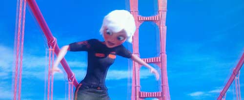
If you look at the picture without using the glasses, this is what you see:

This is a scene (on pause, but this doesn’t effect the alternate imaging which creates the 3D effect) from a demo disc. The disc has four short clips from the 3D version of Monsters vs Aliens, repeated eleven times for a total duration of over two hours. It is labelled for shop use only.

Now it it’s pretty obvious that there are two slightly different images overlaid in this. Remember, one eye is supposed to see only one of these, and the other eye is supposed to see only the other. The reason we can see both is that I made my camera expose this shot with a slow shutter speed so it captured both the left and right, um, fields. I shall call them fields for the moment.

Now I have on my test bench right now a 3D TV and a 3D Blu-ray player, and the disc from which this shot was taken. I shall not identify the brand because the result is very disappointing, and it could be that the devices I have aren’t operating properly. I shall chase that down tomorrow.

So here’s the same shot, but with the camera taking the photo through the right lens of the shutter glasses:

Now, you will notice that the image has firmed up considerably, with it much easier to make out the structure of the bridge tower behind the girl, and see that each set of suspension cables consists of two, not three, cables.

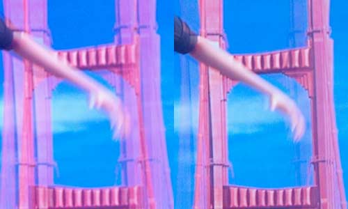
But you will also see that there is a ghost to the left of those features. That’s because there is. I’m hoping this TV is defective, because that is major league crosstalk, or leakage, from one eye to the other (the left eye image has the same problem, but with the relative strength of the fields reversed).

The photo fairly represents what this actually looks like. There was some 3D effect, but it took an effort of will to look for it. Instead, the ghosting (all the way through, although not as obvious in lower contrast scenes) distracted my eyes, made the 3D effect quite unconvincing, and make the video difficult to watch because my eyes felt as though they were blurring the image.

To finish, here is a closer view of the bridge tower, with the both-eye-view on the left, and the right-eye-view on the right, complete with marked crosstalk or ghosting from the left eye view:

If this turns out to be defective equipment, then I shall actually be kind of happy that I’ve had this opportunity to learn how important crosstalk can be.

If it isn’t defective, then this equipment cannot be recommended.

Posted in 3D, Video | 11 Comments

Energy Saving Switch

I’m just setting up a 52 inch Sony TV. After putting it on its stand, I loaded the remote with batteries, hit the remote’s standby switch, and nothing happened. That’s fine, all I had to do was find the hard power switch. From experience I know that at least half the time I can’t find these, so I consulted the manual.

No problems, there it was. But it reminded me that in these green times, they aren’t called hard power switches or anything like that. Now Sony calls it an ‘Energy Saving Switch’.

Posted in Eco, Equipment | Leave a comment

Retrofitting TVs for 3D

Reader Sam emailed me with a very interesting question:

Your review of a 3D TV on Monday was very interesting. I have an LCD HD TV which handles 1080p 50Hz inputs,  as would most, if not all, HD TVs. It would be a simple matter to synchronise polarising glasses to alternate frames with a simple set top box, which should be a lot cheaper than a full HD compatible unit. Why can’t 3D TV be presented in such a manner?

Actually, I was reporting on the Panasonic 3DTV launch, rather than doing a formal review. But back to the question.

The problem is that in order to synchronise the shutters in the glasses to the display of frames on the TV, information from inside the TV is required. The device suggested would only know about the signal being fed into the TV.

The various TV technologies are quite variable in how long they take to organise and process the signals prior to displaying them. Some manage it in a few tens of milliseconds. High end Philips TVs take about 200 milliseconds, or one fifth of a second. There’s no way an external device could know this.

Both Sony and Panasonic at their respective launches made bit of a thing about how their technology reduced ‘cross talk’ between the eyes by switching more cleanly and precisely than competing technologies. Whose is better I don’t know. What I do know is that it is clearly an issue if they both felt compelled to talk about it. Given that with a 50 hertz system each eye is receiving its picture for just 20 milliseconds, even a drift of a millisecond or two would probably be fatal to the effect.

I suppose one could have some kind of delay knob on the device, but that’s a level of complexity I’m sure everyone is keen to avoid.

Oh, one more thing: there are differences between the plasma and LCD versions of the 3D shutter glasses, due to the fact that LCD displays are polarised while plasma ones aren’t.

Posted in 3D, Video | 8 Comments

The Art of the Title Sequence

Really, the title says it all. If you find the way some movie titles are presented interesting, go to The Art of the Title Sequence.

My favourite titles of all time are in Panic Room, deal with by ‘The Art …’ here.

Posted in Cinema | 1 Comment

Super Slow Motion Zombies

The other day I noted that the Blu-ray of Michael Jackson’s This Is It has some trailers hidden on the disc, apparently inaccessible via the play menu.

Well today I discovered that there are zombies hidden on another Blu-ray disc. The disc is Zombieland, another Sony Pictures release. In addition to a decent collection of official special extras, plus the usual Sony 7669 test patterns from the main menu, there are eight files not apparently linked to by anything on the disc. These amount to a little over 23 minutes of full 1080p24 HD sitting on the disc, essentially inaccessible to most.

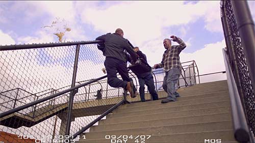
So what are these zombies? These are eight extremely slow motion clips that seem to be basically raw (ie. not colour or contrast adjusted). Here’s a shot from one:

Man falling down stairs

That splash to the left and above the railing is the falling man’s coffee cup going flying. This really is super slow motion. I’d say at least 10:1 and probably more.

Here are descriptions of the file contents:

File Content Length
05017.m2ts Zombie being punched in head and flinging blood from mouth, in slow motion 0:53
05018.m2ts Zombie shaking head and flinging blood from mouth, in slow motion 4:09
05019.m2ts Man running from Zombies as car explodes behind them, in slow motion 4:22
05020.m2ts Zombie attack on man who falls down steep stairs, in slow motion 2:02
05021.m2ts Two Zombies fighting two men on bonnet of Police car, in slow motion 4:56
05022.m2ts Guy watering plants attacked by Zombie, in slow motion 2:50
05023.m2ts Guy being slapped across face five times, in slow motion 1:53
05024.m2ts Guy spewing a large quantity of water, in slow motion 1:59

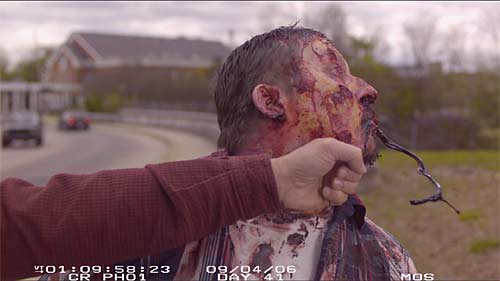
Here’s the Zombie being punched in 05017.m2ts. The splash of blood shows how quick the shutter speed was:

Posted in Blu-ray, Disc details | 1 Comment

Is This Really It?

In a comment to an earlier post, Craig makes some astute observations about the insertion of apparent SD material into Michael Jackson’s This Is It. I have now belatedly watched the movie and have been trying to work out what was going on with these segments.

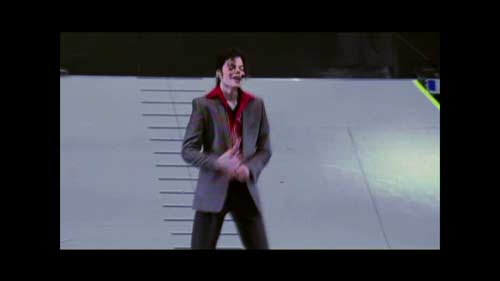
The first thing was to confirm whether these are actually SD. I grabbed a stack (ie, nearly 8,000) frames from the movie and checked out a few. Here is an example of one of these frames:

Picture, letterboxed and pillarboxed

A natural way of inserting SD into a frame like this would suggest a picture height of 480 pixels (assuming US style SD). The actual size of the picture part of these frames is 1,458 by 836 pixels. So if SD, it was scaled up.

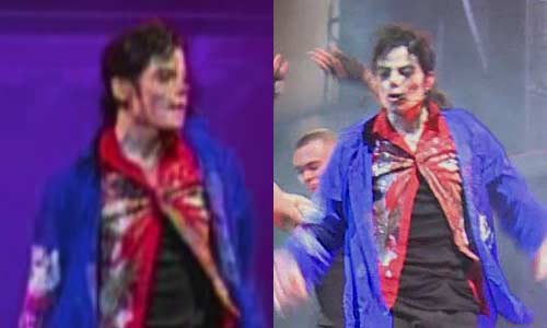
Certainly the resolution is very low. Here are details from two adjacent ‘I’ frames. Obviously the left one is the low resolution one, while the right one is by no means the most detailed or sharpest of the high resolution ones. Still, the relative lack of resolution in the left one is obvious:

Low res vs high res

To my eye, the low res stuff looks SD, or worse (perhaps because I am used to PAL as SD). It has been scaled up, but wisely not to the full size of the frame.

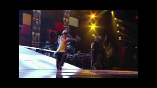
I attempted to estimate the actual resolution of the source by checking jaggies. These appear irregularly, and I’ll talk about a variation on these in a moment. But I was looking for black and white jaggies primarily because these avoid issues of the lower resolution colour signals. I found this frame with a jagged diagonal (others nearby have smooth slopes):

Jaggies overview

Here is the bottom of the white ramp to the right of dancer, unscaled by me this time:

Jaggies up close

I measured the height of ten of those jaggies, and they yielded an average height of 4.6 pixels. Dividing that into the picture height of 836 pixels suggested that about 181 jaggies would fit into the full height of the picture. But the reason these jaggies are here is most like because, for some reason that isn’t clear, this particular frame was deinterlaced poorly, leading to a two-scan-line tall step pattern. This interfered with the scaling up in resolution of the picture to a smooth result. So that would suggest that there were 2 times 181 scan lines or vertical pixels in the source: about 362 pixels.

Since most camcorders default to 4:3 aspect ratio, my guess would be that the source was letterboxed into a widescreen format.

Remember the picture width I mentioned earlier? That was 1,458 pixels. Multiply that by three and divide by four and you get 1,093, which would have been the relative height of the full 4:3 picture, compared to the actual 836 that we have. Take our presumed 362 pixel picture height, multiply by 1,093 and divide by 836 and we get 473 pixels tall for the original source. Which, in my book given the uncertainties of my measurements, is close enough to 480 pixels, or US-style standard definition.

Now, was the output via composite video? Or some other analogue format? Or digital?

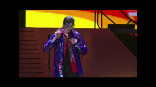
Certainly, by comparison with the high res stuff, it is extremely soft and lacks contrast, but that could be simply because it comes from inexpensive camcorders. Here’s a detail from a frame that suggests that the output was via composite video:

Rainbows on the jacket

The rainbow pattern appears on Jackson’s jacket, which the HD portions reveal to have a fine herringbone pattern. The production of rainbow artefacts is a common byproduct of composite video, due to cross interference between the luminance and chroma portions of the mixed signal in composite video. That would suggest composite, but there are other possibilities.

Another strong marker of composite video is what I call ‘dot crawl’ around strong colour boundaries. This consists of dots of noise swirling in a semi-random way very close to those boundaries. The SD sections in this movie don’t seem to have this as far as I could see. But ‘dot crawl’ is more easily controlled than rainbow artefacts by the use of high quality comb filtering (to better extract clean chroma and luminence from the signal).

Some other defects in the picture can be misinterpreted as dot crawl. For example, let’s look at the top right corner of this frame:

Bright colours

Here is that section of the picture unscaled:

Closeup of the colours

You can see that the black diagonal seems smooth against the yellow background, but jaggie against the red. That is due to the low resolution of the red in the signal, which hasn’t been scaled up smoothly for presentation in this format.

So whether it is composite is not absolutely certain, but it is still very different and inferior to the HD material.

Still, given the unexpected need to use whatever was available to produce this movie, the SD allows the addition of different angles in fast cuts to provide a fairly professional result. I suspect that the producers consider the SD element a feature rather than a bug.

Posted in Blu-ray, Video | 1 Comment

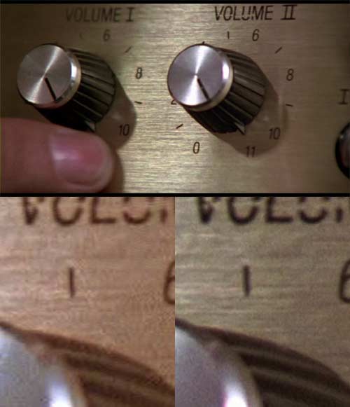
Blu-ray vs DVD comparison: This Is Spinal Tap

This is the classic, of course. Being shot in 1984, and done in a documentary shaky-cam style, it is far from the sharpest of Blu-rays on the market …

Hang on. I was just about to write: ‘In fact, it might even have been shot in 16mm, given the relatively soft and grainy image.’ Then I thought it might be smart to check. According to IMDB, it was indeed shot in Super 16, which is a single sprocket hole version of 16mm film allowing a slightly wider frame. Which explains a lot.

Nonetheless, the Blu-ray is much cleaner than the DVD, and a bit more detailed. This isn’t the most revealing of the comparison shots, but it is the most fun:

This Is Spinal Tap comparison

Posted in Blu-ray, Disc details, DVD | Leave a comment